
Lectric eBikes Brand Refresh

LETTING THE GOOD TIMES ROLL
Riding a bike is a distinctly American pastime; one passed down through generations and rooted in freedom, independence, and simple joy.
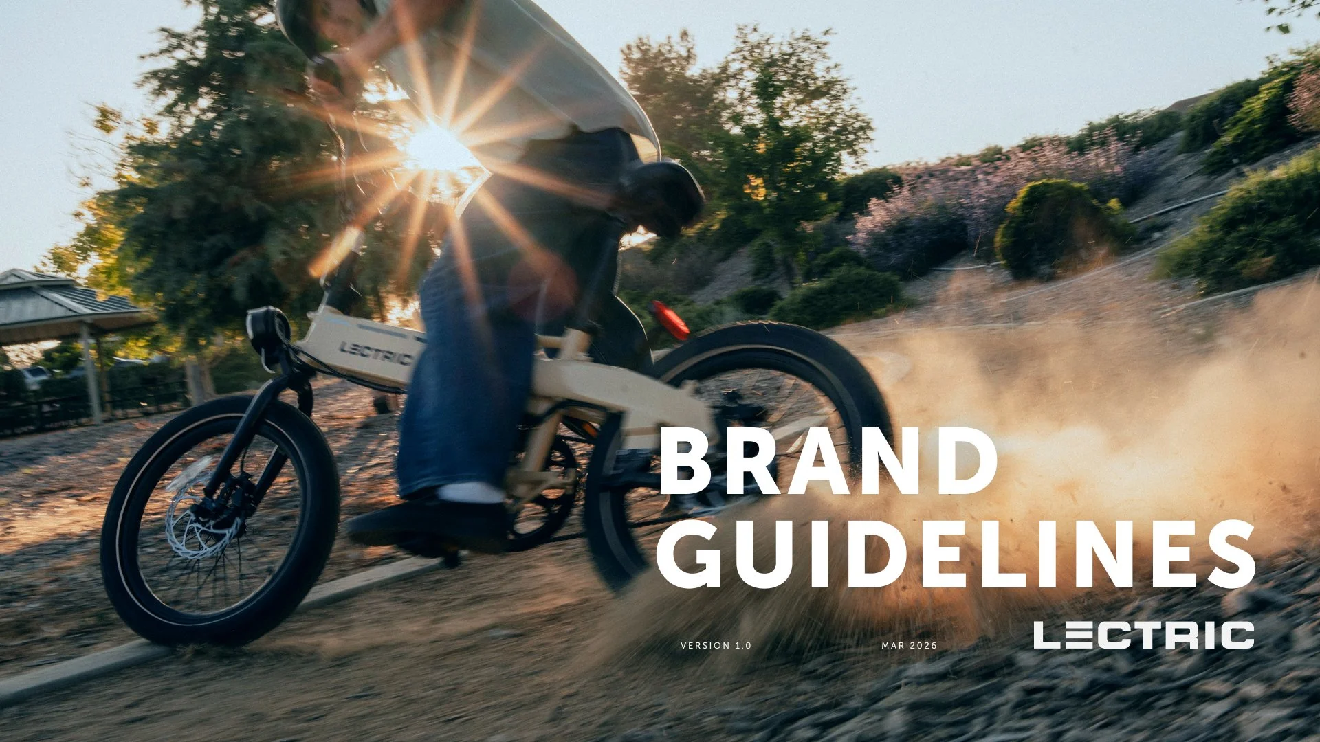
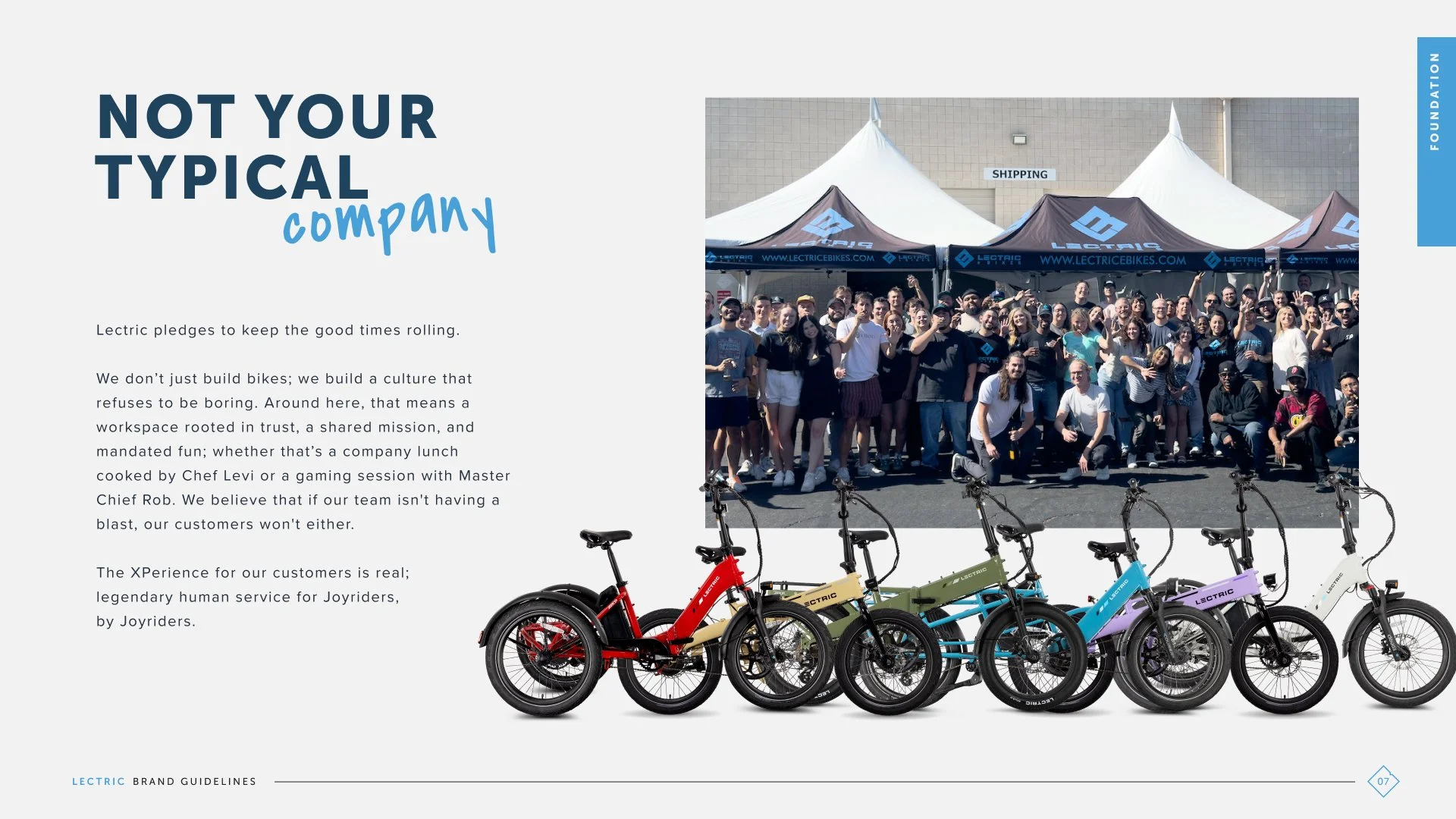
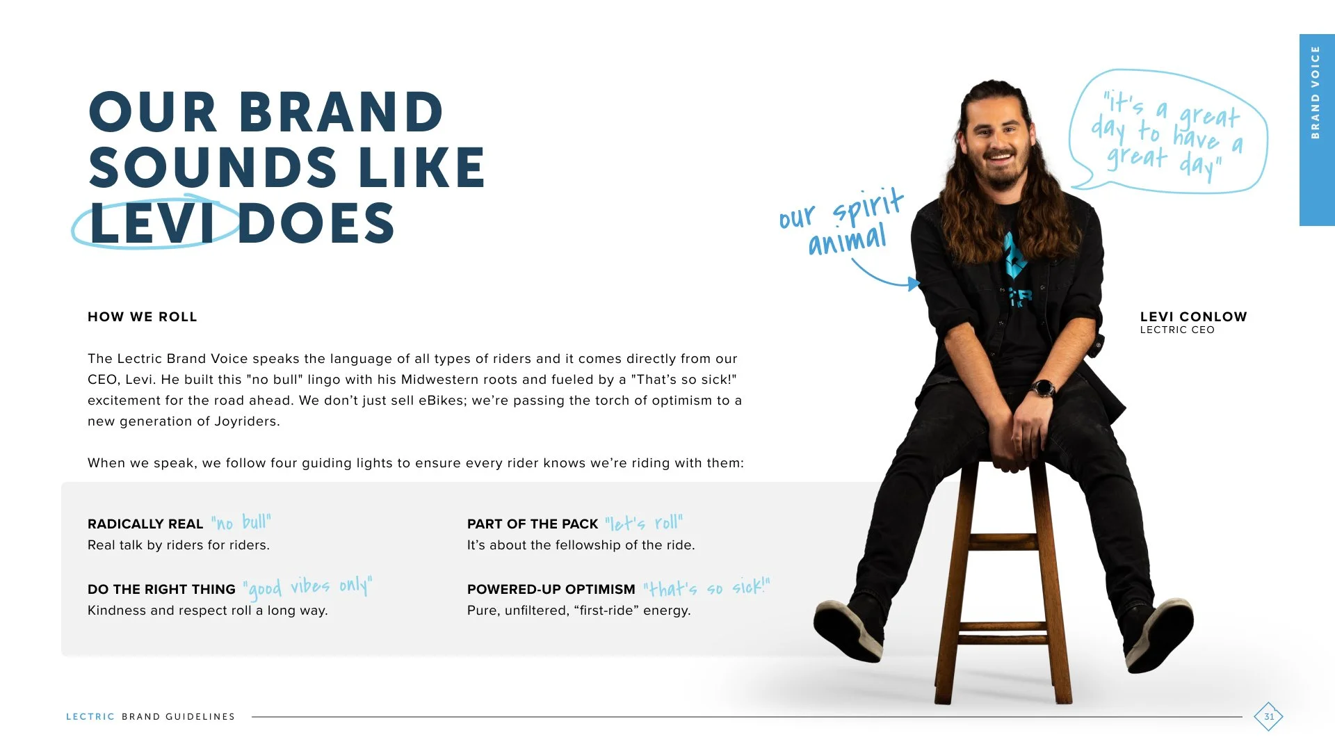
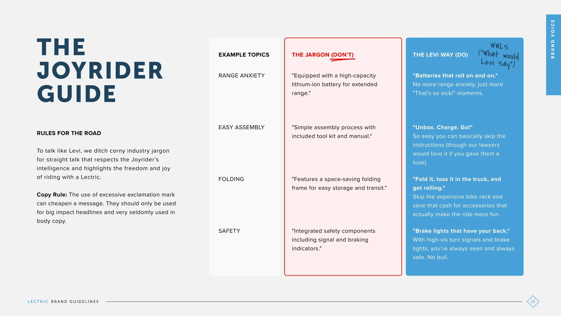
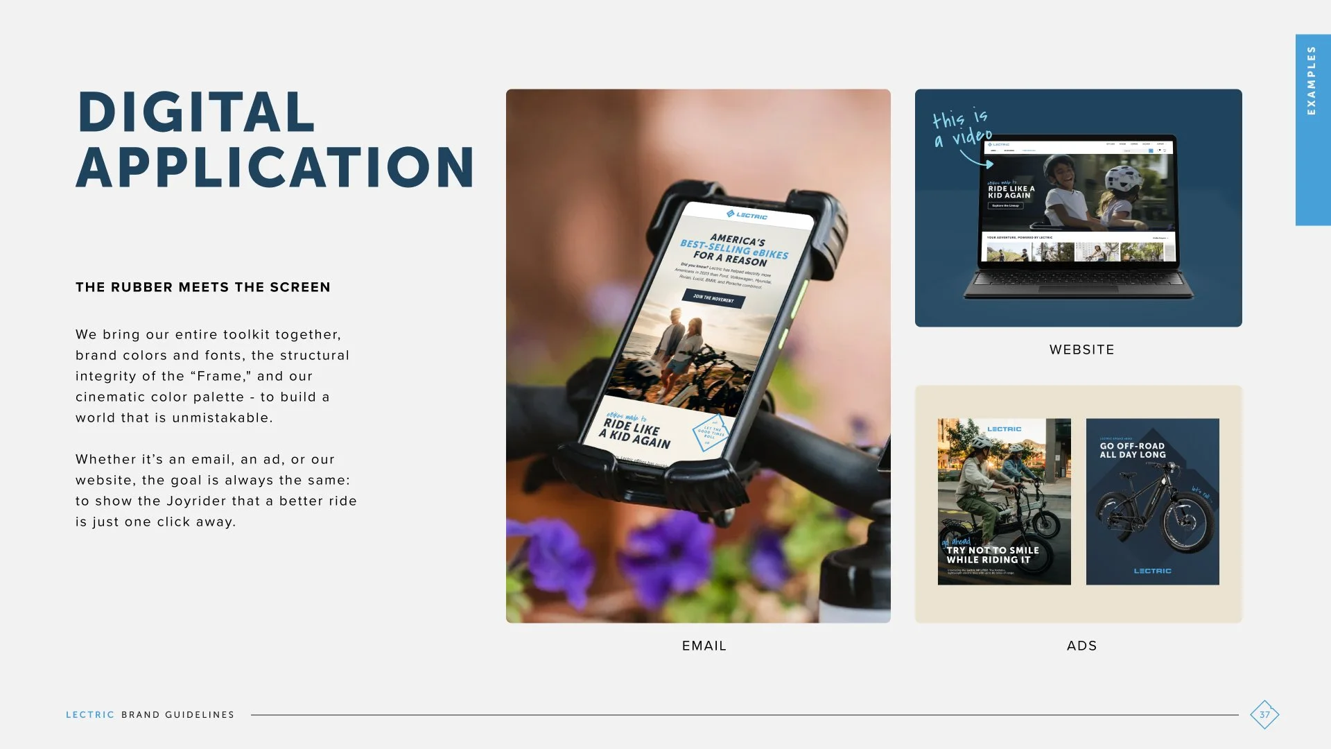
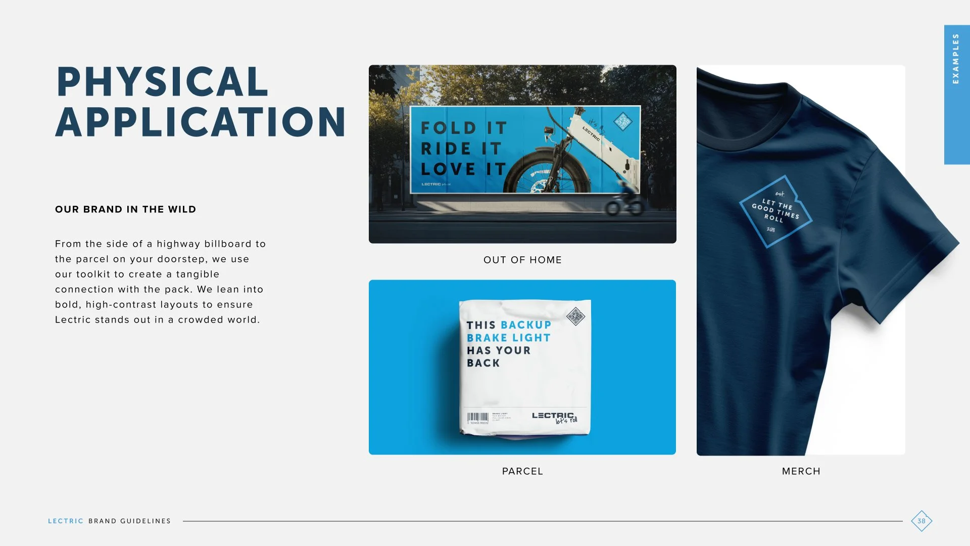
When I had the opportunity to refresh the nation’s #1 eBike brand, the goal wasn’t to reinvent Lectric. It was to strengthen what people already loved, sharpen the brand’s most recognizable assets, and build a more cohesive system across video, web, advertising, email, and print.
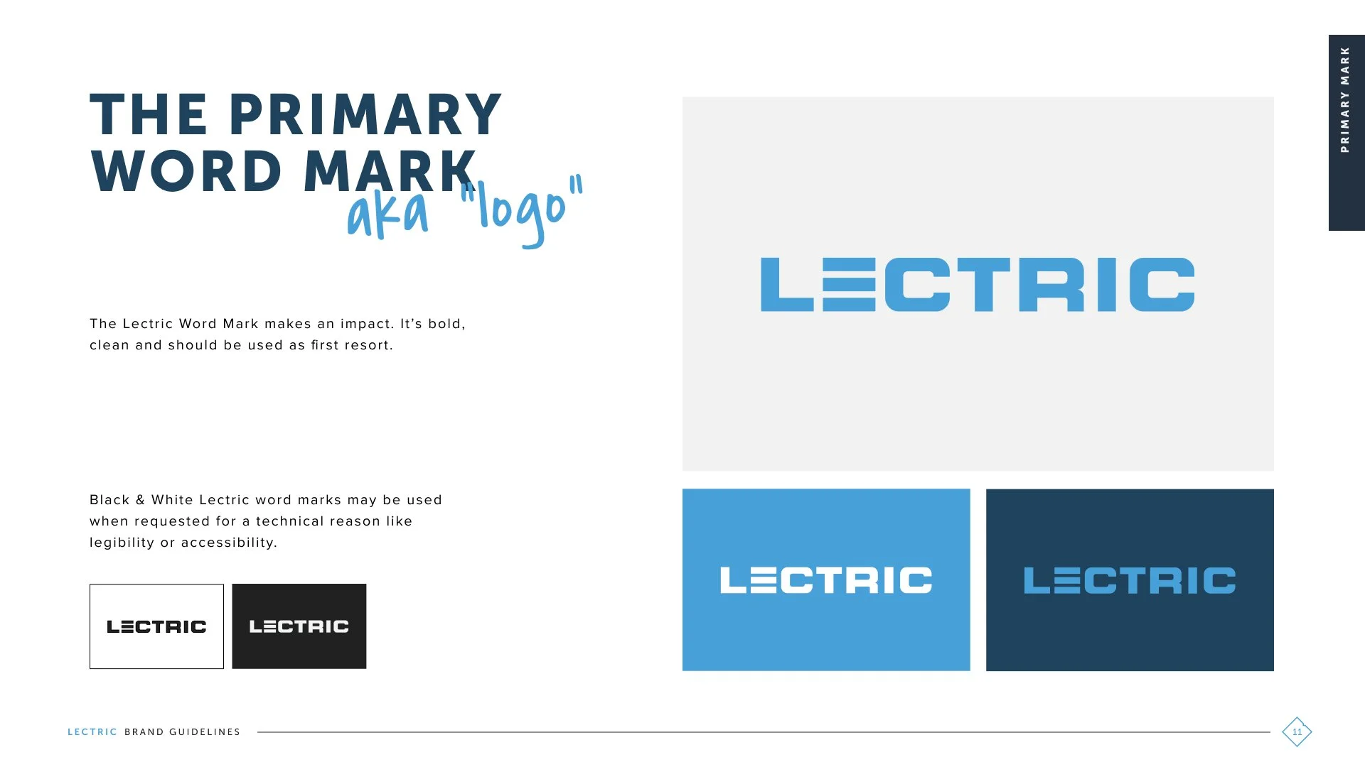
The refreshed identity refined existing elements, including the Lectric logo mark, while introducing new tools designed to make the brand more expressive, recognizable, and consistent:
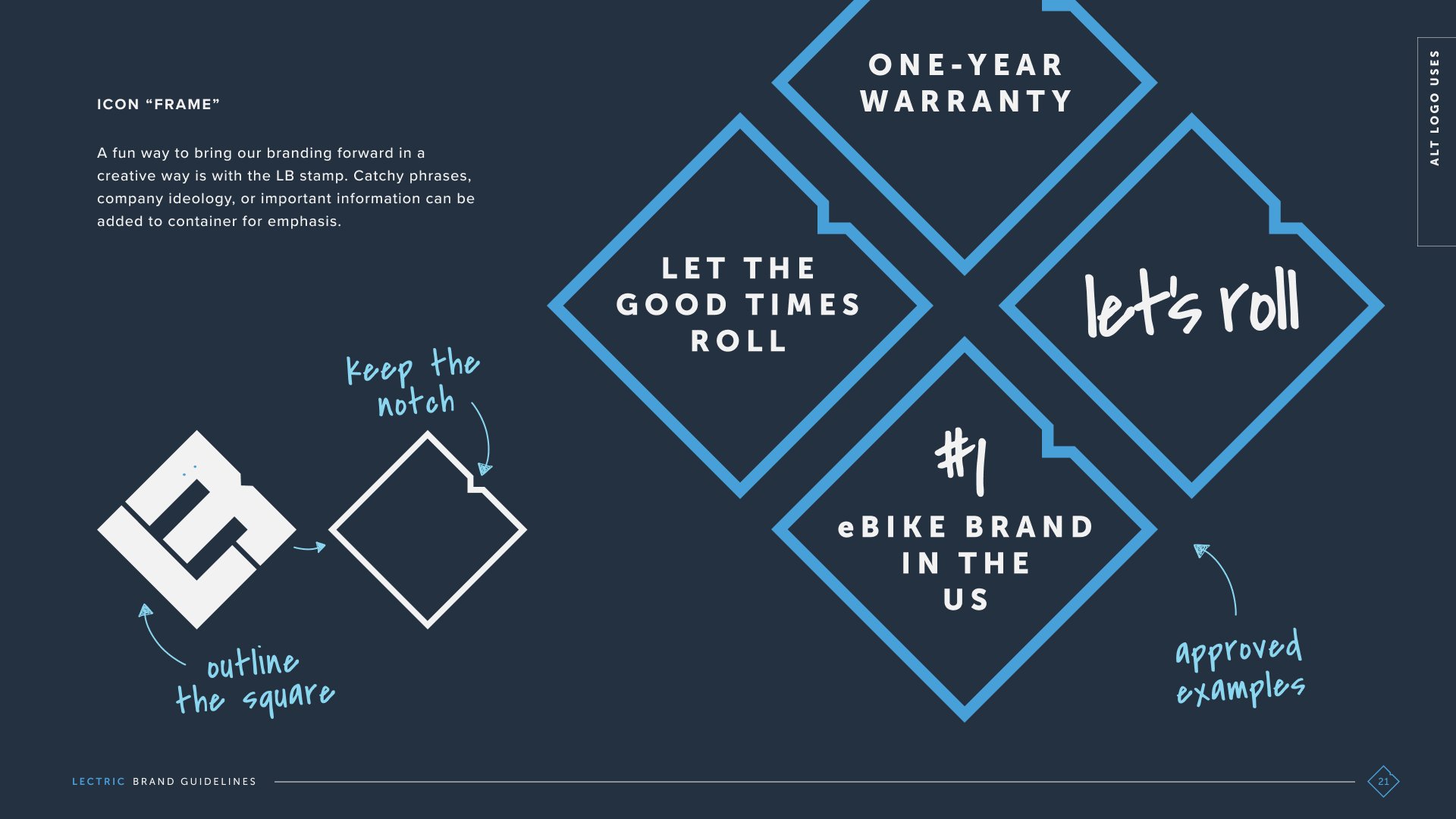
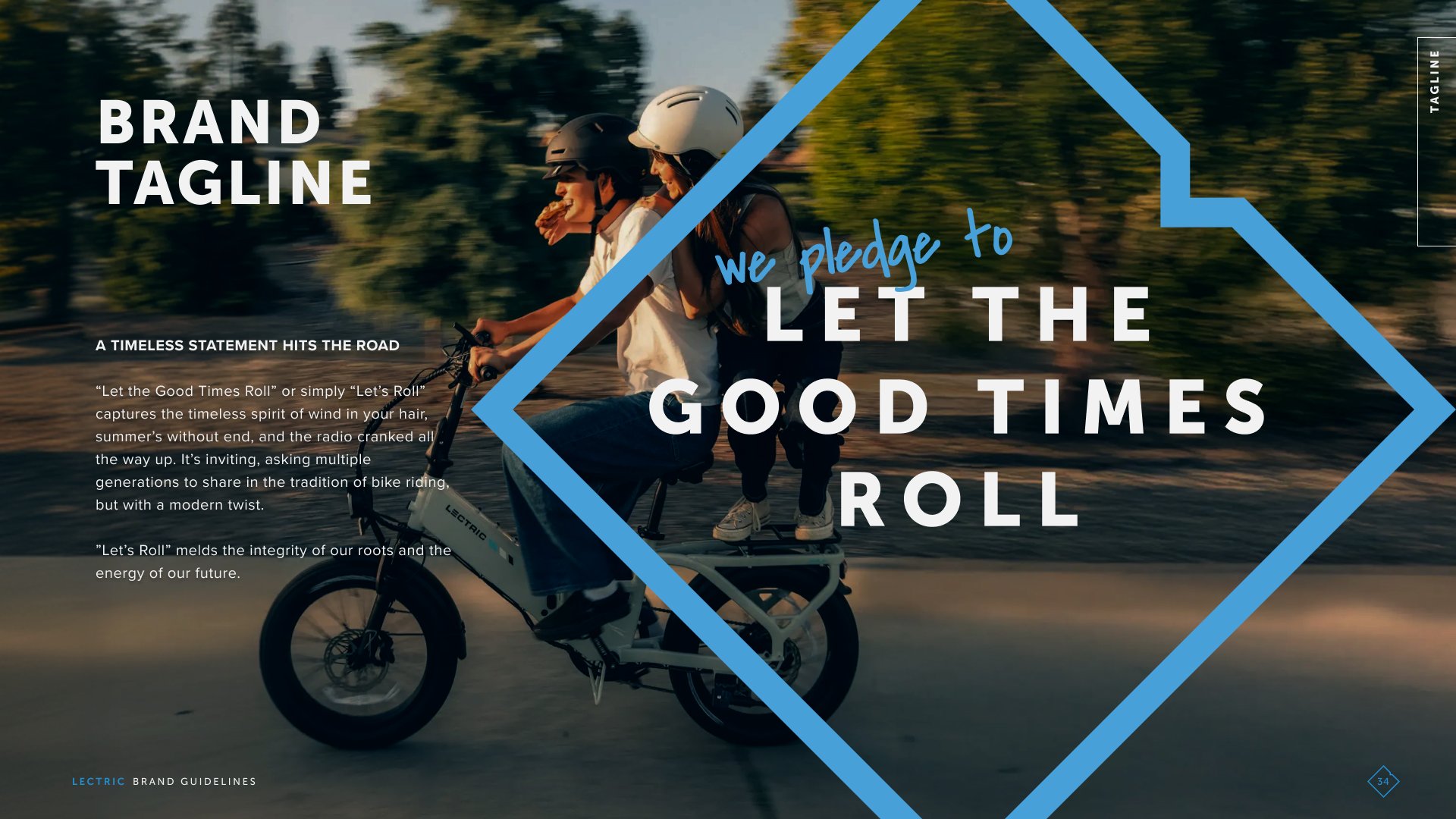
A new brand tagline: “Let’s Roll”
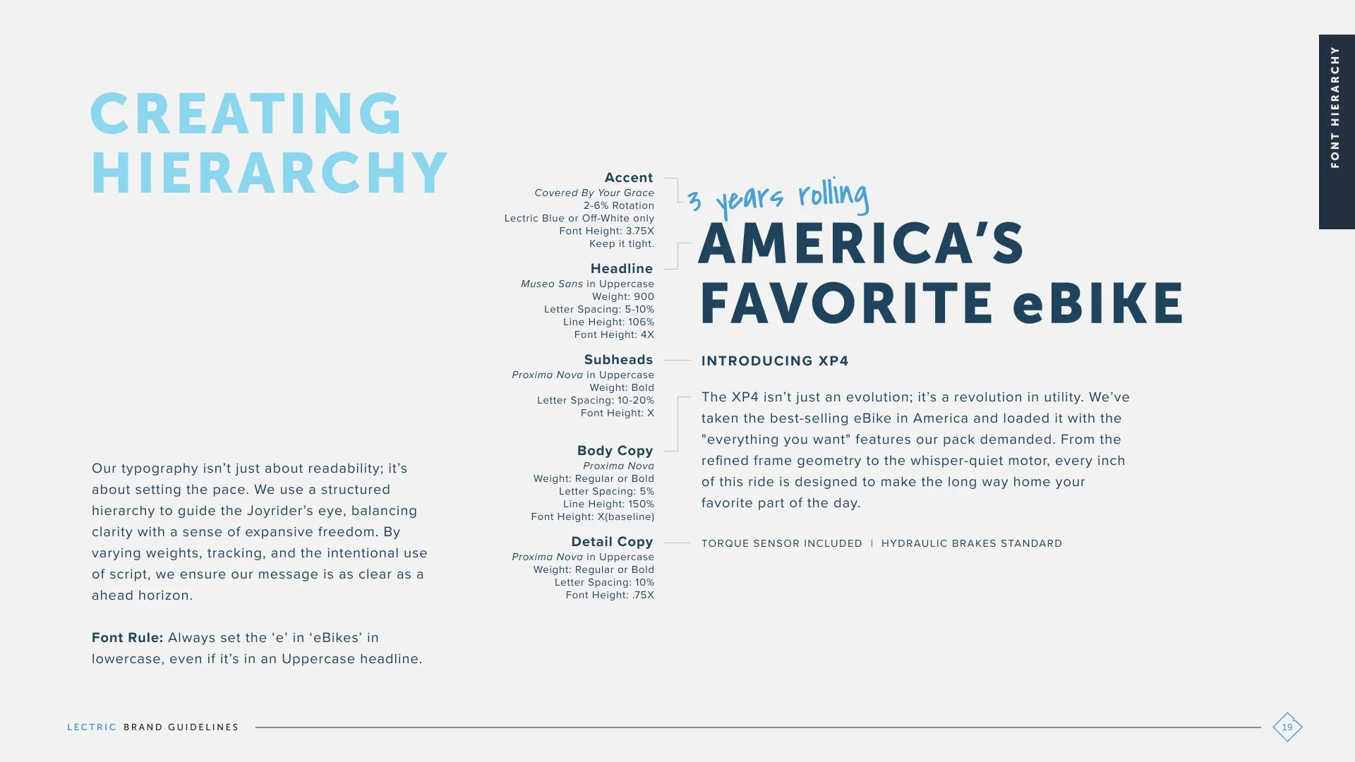
A handwritten accent typeface that adds personality and energy
A proprietary graphic device inspired by the shape of an eBike frame
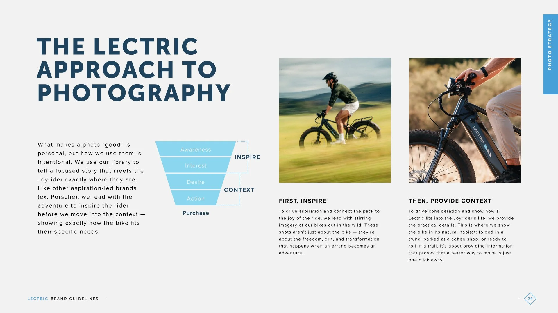
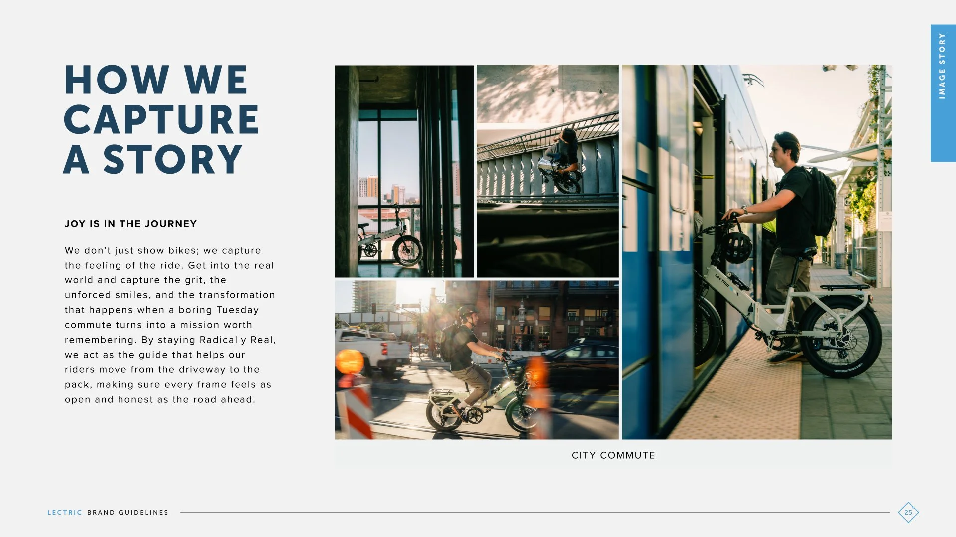
New photography, motion, and color-grading guidelines
A flexible system of animated logo treatments
The RESULTS
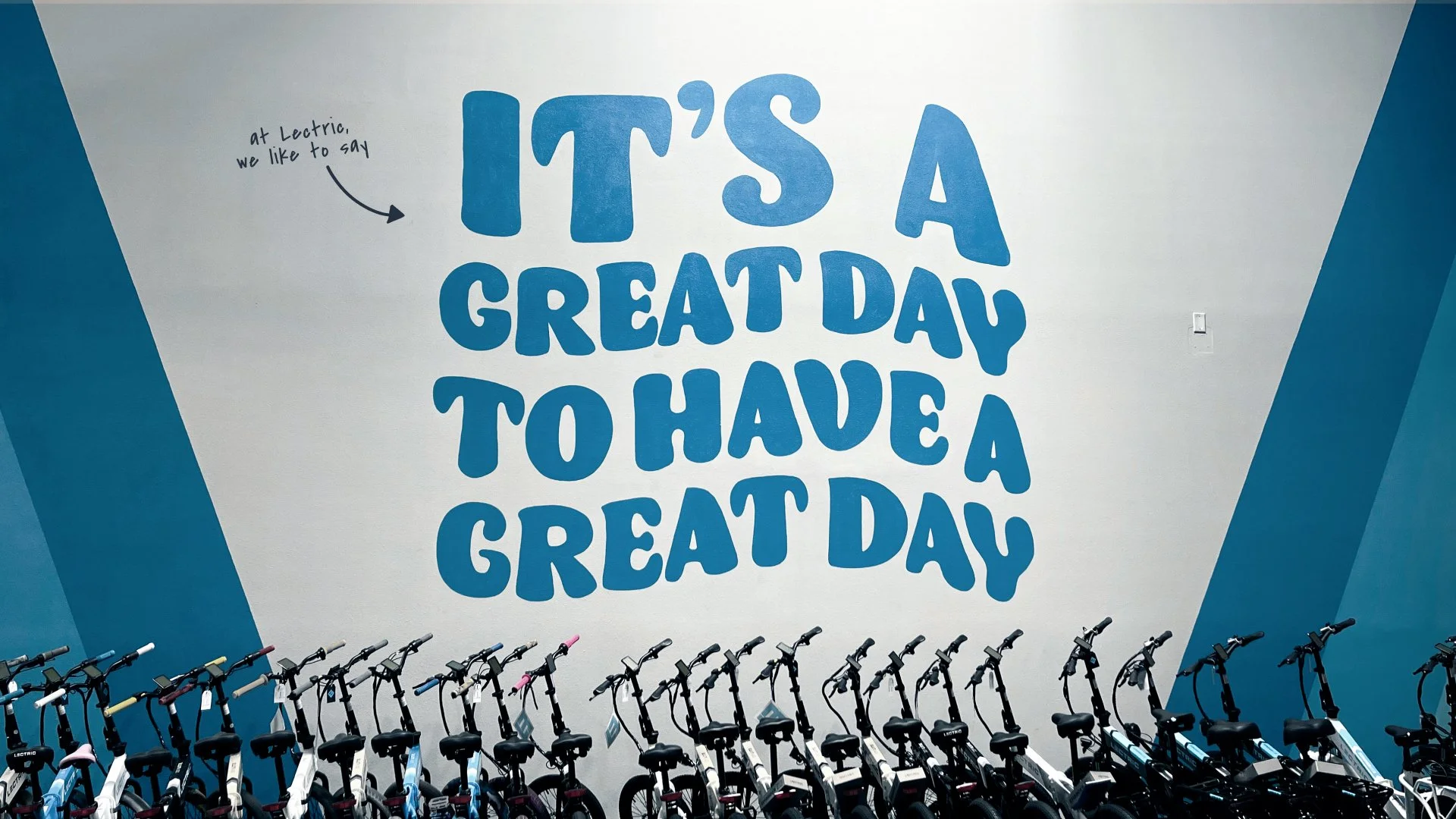
The result is a brand that feels more unified without losing the approachable, optimistic spirit that helped make Lectric successful in the first place.
Canadian Market Launch
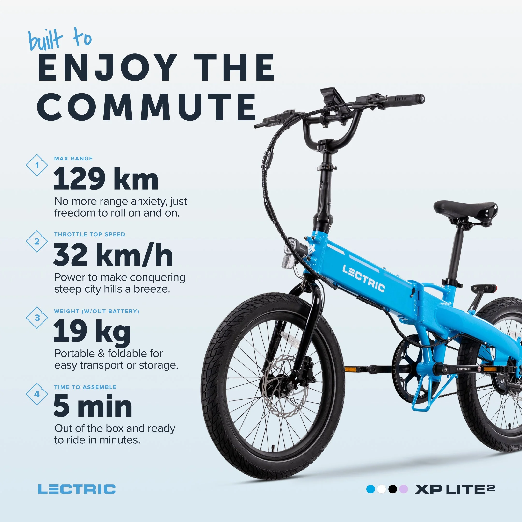
Lectric XP Lite2 “Scorecard” Ad Unit

Lectric XPeak Ad Unit